Difference between revisions of "Graphing"
(→Line Plots) |
|||
| (14 intermediate revisions by 2 users not shown) | |||
| Line 1: | Line 1: | ||
= Introduction = | = Introduction = | ||
| + | |||
| + | Matlab has some very powerful graphics capabilities for plotting data in many different styles. Whilst the syntax for most of the basic plotting functions is simple, the more advanced features can be quite daunting to the uninitiated. In this section we introduce some of the common plot types that you will need in your econometric analysis and presentation. | ||
| + | |||
| + | For a complete exposition of all Matlab's graphics features refer to [http://uk.mathworks.com/help/pdf_doc/matlab/graphg.pdf Matlab's Graphics Guide]. | ||
= Line Plots = | = Line Plots = | ||
| Line 11: | Line 15: | ||
</source> | </source> | ||
| − | The data contains a (100x10) matrix of stock market observations and we are going to plot all of these data point on a single line plot using the < | + | The data contains a (100x10) matrix of stock market observations and we are going to plot all of these data point on a single line plot using the <code>plot</code> function. |
<source> | <source> | ||
| Line 18: | Line 22: | ||
</source> | </source> | ||
| − | [[File:lineplot1.png | + | [[File:lineplot1.png]] |
| − | To modify an existing plot use the < | + | To modify an existing plot use the <code>hold all</code> command. Subsequent plots will then be added to the current figure. For example to add to a horizontal lines for the mean and another two indicating +/- 1 standard deviation from the mean for the stocks data: |
<source> | <source> | ||
| − | sd=std(stocks(:); | + | avg=mean(stocks(:)); |
| − | hold | + | sd=std(stocks(:)); |
| − | plot(xlim, [sd sd],'--r') | + | hold all |
| − | plot(xlim, [-sd -sd],'--r') | + | plot(xlim, [avg avg],'-k') |
| + | plot(xlim, [avg+sd avg+sd],'--r') | ||
| + | plot(xlim, [avg-sd avg-sd],'--r') | ||
</source> | </source> | ||
[[File:lineplot2.png]] | [[File:lineplot2.png]] | ||
| − | Here, in each case the < | + | Here, in each case the <code>plot</code> function is plotting a straight line between two points. The first argument, <code>xlim</code> queries the figure to get the coordinates of the start and end of the x-axis (a two element vector), provides the x coordinates. The second argument is a vector containing the corresponding y coordinates of the two points. |
| − | The '--r' arguments specifies the plotted line | + | The '-k' argument specifies the plotted line to be a solid black line, whereas the '--r' arguments specifies the plotted line as a red dashed line. Matlab supports a number of line (and marker) types of varying colours; for full details refer to Matlab's documentation on [http://uk.mathworks.com/help/matlab/ref/linespec.html LineSpec]. |
= Scatter Diagrams = | = Scatter Diagrams = | ||
In this example we use the wage data from the Wooldridge dataset 'wages1' | In this example we use the wage data from the Wooldridge dataset 'wages1' | ||
| − | + | [http://www.cengagebrain.com/cgi-wadsworth/course_products_wp.pl?fid=M20b&product_isbn_issn=9781111531041&token=8D04240DC39B22D05B49B265F2C8E62C6876DDE99FE979BC4A500075EC976963ED1045639B2C75C4B5B2337F07088998 Wooldridge data sets] | |
<source> | <source> | ||
| Line 76: | Line 82: | ||
== Theoretical Distributions == | == Theoretical Distributions == | ||
| + | Matlab has a number of statistical distributions, see the [[StatFunct | entry on statistical distributions]] for an introduction. We can use the <code>plot</code> function to graph these distributions. The first thing to do is generate a vector of suitable values for the x-axis; in this example we use the <code>linspace</code> function to create a <math>(1000 \times 1)</math> vector of evenly spaced points between -5 and 5 on the x-axis. We then use this vector as the input to our distribution of choice (e.g. the Normal PDF) to obtain a vector of the probabilities for each corresponding x value; these will form our y-axis values in the plot. | ||
<source> | <source> | ||
| Line 86: | Line 93: | ||
[[File:TheoreticalPlot1.png]] | [[File:TheoreticalPlot1.png]] | ||
| + | As before, we can add additional plots to this graph. In the next example we plot the t-distribution for increasing degrees of freedom <code>df=[1,5,10]</code> to show how the t-distribution approximates to the Normal distribution as the degrees of freedom increases. | ||
<source> | <source> | ||
| Line 101: | Line 109: | ||
== Observed Distributions/Kernel Density Plots == | == Observed Distributions/Kernel Density Plots == | ||
| + | Kernel Density estimation is a way to estimate the probability density function of a random variable from a sample of data. Returning to the stock market values data used above we can fit a PDF to this data using the <code>ksdensity</code> function. We input our observations and the function will return two outputs, <code>xi</code>, a vector of x-coordinates at which the density was evaluated and <code>fi</code> a corresponding vector of densities. We can then use these outputs to produce a nice plot as follows: | ||
<source> | <source> | ||
| Line 109: | Line 118: | ||
</source> | </source> | ||
[[File:KernelPlot1.png]] | [[File:KernelPlot1.png]] | ||
| + | |||
| + | Here the <code>ksdensity</code> chose the values at which to evaluate the density itself. If you were planning to compare this to a different distribution, i.e. one of the theoretical distributions discussed above, you could also force the function to evaluate the density at the same x-coordinates by calling <code>ksdensity(stocks(:),x)</code> where <code>x</code> is defined as above. | ||
| + | |||
| + | = Saving Plots = | ||
Latest revision as of 13:04, 27 October 2015
Contents
Introduction
Matlab has some very powerful graphics capabilities for plotting data in many different styles. Whilst the syntax for most of the basic plotting functions is simple, the more advanced features can be quite daunting to the uninitiated. In this section we introduce some of the common plot types that you will need in your econometric analysis and presentation.
For a complete exposition of all Matlab's graphics features refer to Matlab's Graphics Guide.
Line Plots
For this example we use one of Matlab's sample dataset to plot a simple line plot showing the time series movement of the stock market data. First Load the data.
load stockreturnsThe data contains a (100x10) matrix of stock market observations and we are going to plot all of these data point on a single line plot using the plot function.
figure
plot(stocks(:))
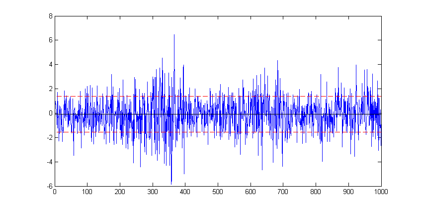
To modify an existing plot use the hold all command. Subsequent plots will then be added to the current figure. For example to add to a horizontal lines for the mean and another two indicating +/- 1 standard deviation from the mean for the stocks data:
avg=mean(stocks(:));
sd=std(stocks(:));
hold all
plot(xlim, [avg avg],'-k')
plot(xlim, [avg+sd avg+sd],'--r')
plot(xlim, [avg-sd avg-sd],'--r')
Here, in each case the plot function is plotting a straight line between two points. The first argument, xlim queries the figure to get the coordinates of the start and end of the x-axis (a two element vector), provides the x coordinates. The second argument is a vector containing the corresponding y coordinates of the two points.
The '-k' argument specifies the plotted line to be a solid black line, whereas the '--r' arguments specifies the plotted line as a red dashed line. Matlab supports a number of line (and marker) types of varying colours; for full details refer to Matlab's documentation on LineSpec.
Scatter Diagrams
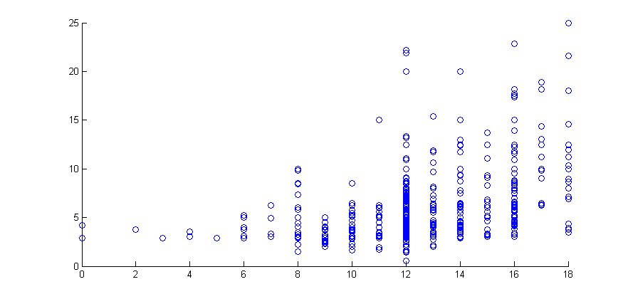
In this example we use the wage data from the Wooldridge dataset 'wages1' Wooldridge data sets
figure
scatter(educ,wage)
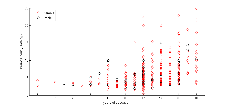
Scatter by group, in this case on gender.
gscatter(educ,wage,female,'rk','do')
xlabel('years of education')
ylabel('average hourly earnings')
legend('female','male','Location','northwest')
Histograms
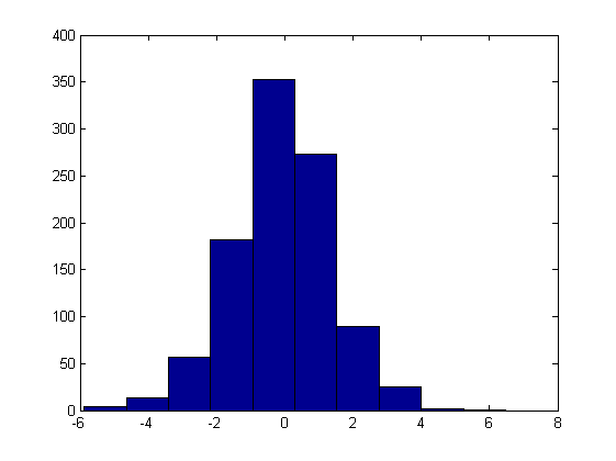
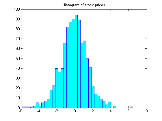
hist(stocks(:))figure
hist(stocks(:),40)
set(get(gca,'child'),'FaceColor','cyan','EdgeColor','blue');
title('Histogram of stock prices')Distribution Plots
Theoretical Distributions
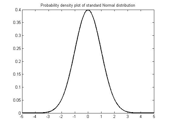
Matlab has a number of statistical distributions, see the entry on statistical distributions for an introduction. We can use the plot function to graph these distributions. The first thing to do is generate a vector of suitable values for the x-axis; in this example we use the linspace function to create a [math](1000 \times 1)[/math] vector of evenly spaced points between -5 and 5 on the x-axis. We then use this vector as the input to our distribution of choice (e.g. the Normal PDF) to obtain a vector of the probabilities for each corresponding x value; these will form our y-axis values in the plot.
x=linspace(-5,5,1000);
xnorm = normpdf(x);
figure
plot(x,xnorm,'-k','LineWidth',2)
title('Probability density plot of standard Normal distribution')
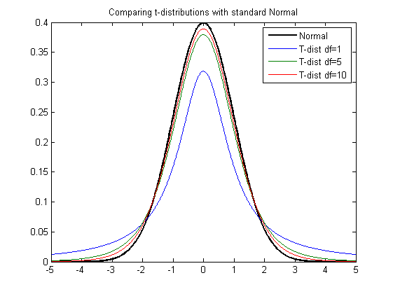
As before, we can add additional plots to this graph. In the next example we plot the t-distribution for increasing degrees of freedom df=[1,5,10] to show how the t-distribution approximates to the Normal distribution as the degrees of freedom increases.
hold all
df = [1,5,10];
for ii=1:length(df)
    xt = tpdf(x,df(ii));
    plot(x,xt)
end
title('Comparing t-distributions with standard Normal')
legend('Normal','T-dist df=1','T-dist df=5','T-dist df=10')
Observed Distributions/Kernel Density Plots
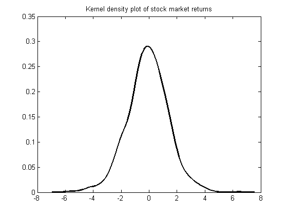
Kernel Density estimation is a way to estimate the probability density function of a random variable from a sample of data. Returning to the stock market values data used above we can fit a PDF to this data using the ksdensity function. We input our observations and the function will return two outputs, xi, a vector of x-coordinates at which the density was evaluated and fi a corresponding vector of densities. We can then use these outputs to produce a nice plot as follows:
figure
[f,xi] = ksdensity(stocks(:));
plot(xi,f,'-k','LineWidth',1.5)
title('Kernel density plot of stock market returns')
Here the ksdensity chose the values at which to evaluate the density itself. If you were planning to compare this to a different distribution, i.e. one of the theoretical distributions discussed above, you could also force the function to evaluate the density at the same x-coordinates by calling ksdensity(stocks(:),x) where x is defined as above.

