Difference between revisions of "Graphing"
(→Scatter Diagrams) |
(→Observed Distributions/Kernel Density Plots) |
||
| Line 100: | Line 100: | ||
== Observed Distributions/Kernel Density Plots == | == Observed Distributions/Kernel Density Plots == | ||
| + | |||
| + | |||
| + | <source> | ||
| + | figure | ||
| + | [f,xi] = ksdensity(stocks(:)); | ||
| + | plot(xi,f,'-k','LineWidth',1.5) | ||
| + | title('Kernel density plot of stock market returns') | ||
| + | </source> | ||
| + | [[File:KernelPlot1.png]] | ||
Revision as of 22:10, 23 October 2015
Contents
Introduction
Line Plots
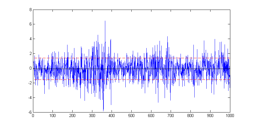
For this example we use one of Matlab's sample dataset to plot a simple line plot showing the time series movement of the stock market data. First Load the data.
load stockreturnsThe data contains a (100x10) matrix of stock market observations and we are going to plot all of these data point on a single line plot using the plot function.
figure
plot(stocks(:))
To modify an existing plot use the hold on command. Subsequent plots will then be added to the current figure. For example to add to horizontal lines indicating +/- 1 standard deviation of the stocks data:
sd=std(stocks(:);
hold on
plot(xlim, [sd sd],'--r')
plot(xlim, [-sd -sd],'--r')
Here, in each case the plot function is plotting a straight line between two points. The first argument, xlim queries the figure to get the coordinates of the start and end of the x-axis (a two element vector), provides the x coordinates. The second argument is a vector containing the corresponding y coordinates of the two points.
The '--r' arguments specifies the plotted line to a red dashed line. Matlab supports a number of line (and marker) types of varying colours; for full details refer to Matlab's documentation on LineSpec.
Scatter Diagrams
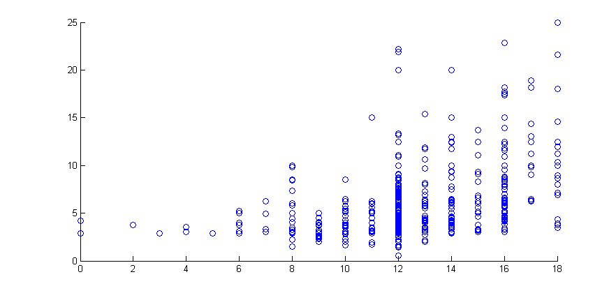
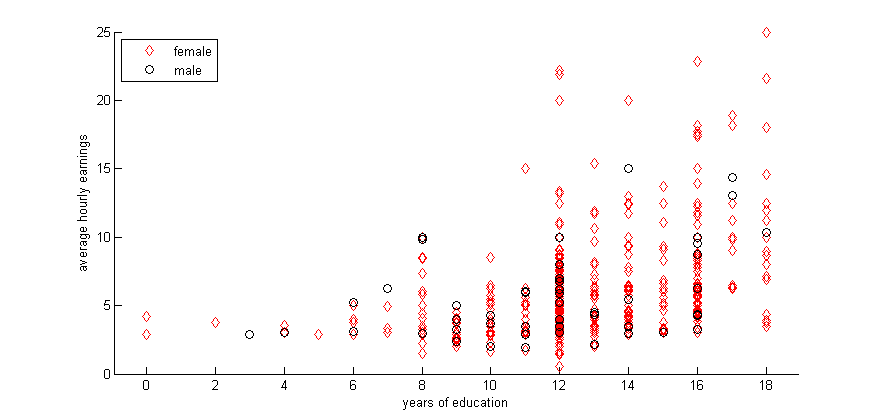
In this example we use the wage data from the Wooldridge dataset 'wages1'
figure
scatter(educ,wage)
Scatter by group, in this case on gender.
gscatter(educ,wage,female,'rk','do')
xlabel('years of education')
ylabel('average hourly earnings')
legend('female','male','Location','northwest')
Histograms
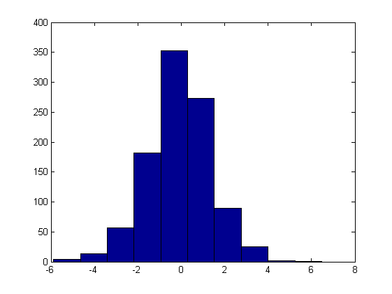
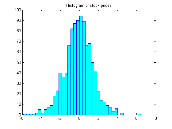
hist(stocks(:))figure
hist(stocks(:),40)
set(get(gca,'child'),'FaceColor','cyan','EdgeColor','blue');
title('Histogram of stock prices')Distribution Plots
Theoretical Distributions
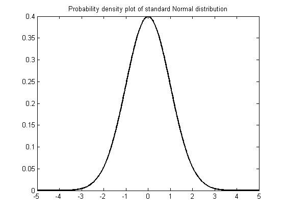
x=linspace(-5,5,1000);
xnorm = normpdf(x);
figure
plot(x,xnorm,'-k','LineWidth',2)
title('Probability density plot of standard Normal distribution')
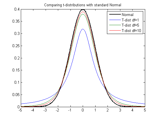
hold all
df = [1,5,10];
for ii=1:length(df)
    xt = tpdf(x,df(ii));
    plot(x,xt)
end
title('Comparing t-distributions with standard Normal')
legend('Normal','T-dist df=1','T-dist df=5','T-dist df=10')
Observed Distributions/Kernel Density Plots
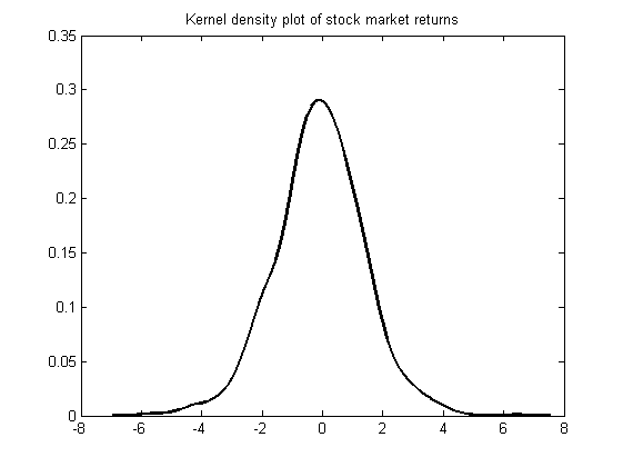
figure
[f,xi] = ksdensity(stocks(:));
plot(xi,f,'-k','LineWidth',1.5)
title('Kernel density plot of stock market returns')
