Graphing
Contents
Introduction
Line Plots
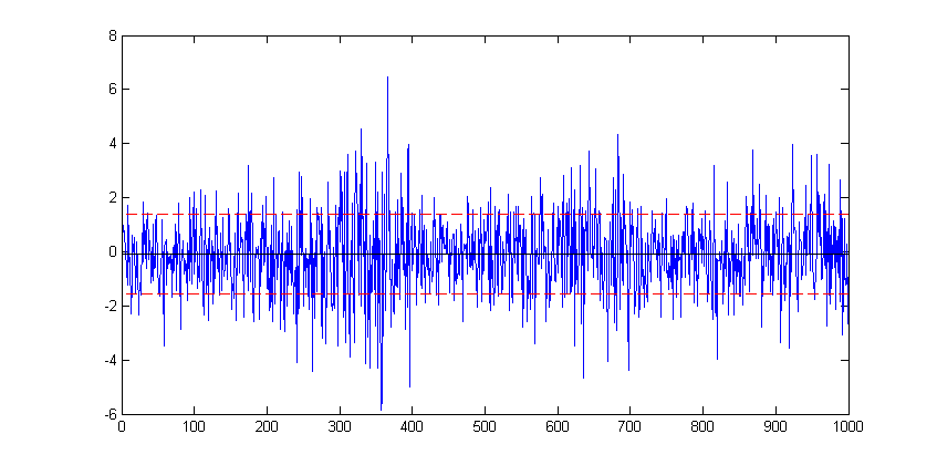
For this example we use one of Matlab's sample dataset to plot a simple line plot showing the time series movement of the stock market data. First Load the data.
load stockreturnsThe data contains a (100x10) matrix of stock market observations and we are going to plot all of these data point on a single line plot using the plot function.
figure
plot(stocks(:))
To modify an existing plot use the hold on command. Subsequent plots will then be added to the current figure. For example to add to horizontal lines indicating +/- 1 standard deviation of the stocks data:
sd=std(stocks(:);
hold on
plot(xlim, [sd sd],'--r')
plot(xlim, [-sd -sd],'--r')
Here, in each case the plot function is plotting a straight line between two points. The first argument, xlim queries the figure to get the coordinates of the start and end of the x-axis (a two element vector), provides the x coordinates. The second argument is a vector containing the corresponding y coordinates of the two points.
The '--r' arguments specifies the plotted line to a red dashed line. Matlab supports a number of line (and marker) types of varying colours; for full details refer to Matlab's documentation on LineSpec.
Scatter Diagrams
figure
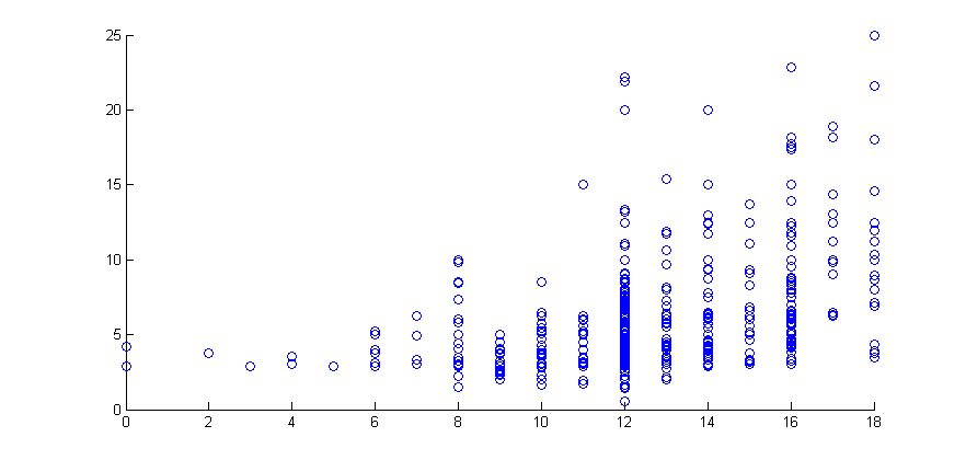
scatter(educ,wage)
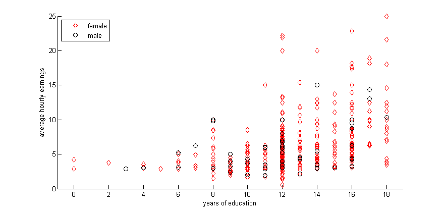
gscatter(educ,wage,female,'rk','do')
xlabel('years of education')
ylabel('average hourly earnings')
legend('female','male','Location','northwest')
Histograms
hist(stocks(:))
</source)
[[File:histplot1.png]]

<source>
figure
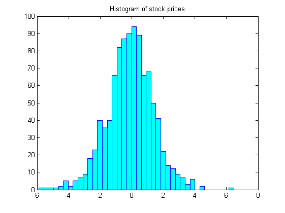
hist(stocks(:),40)
set(get(gca,'child'),'FaceColor','cyan','EdgeColor','blue');
title('Histogram of stock prices')


